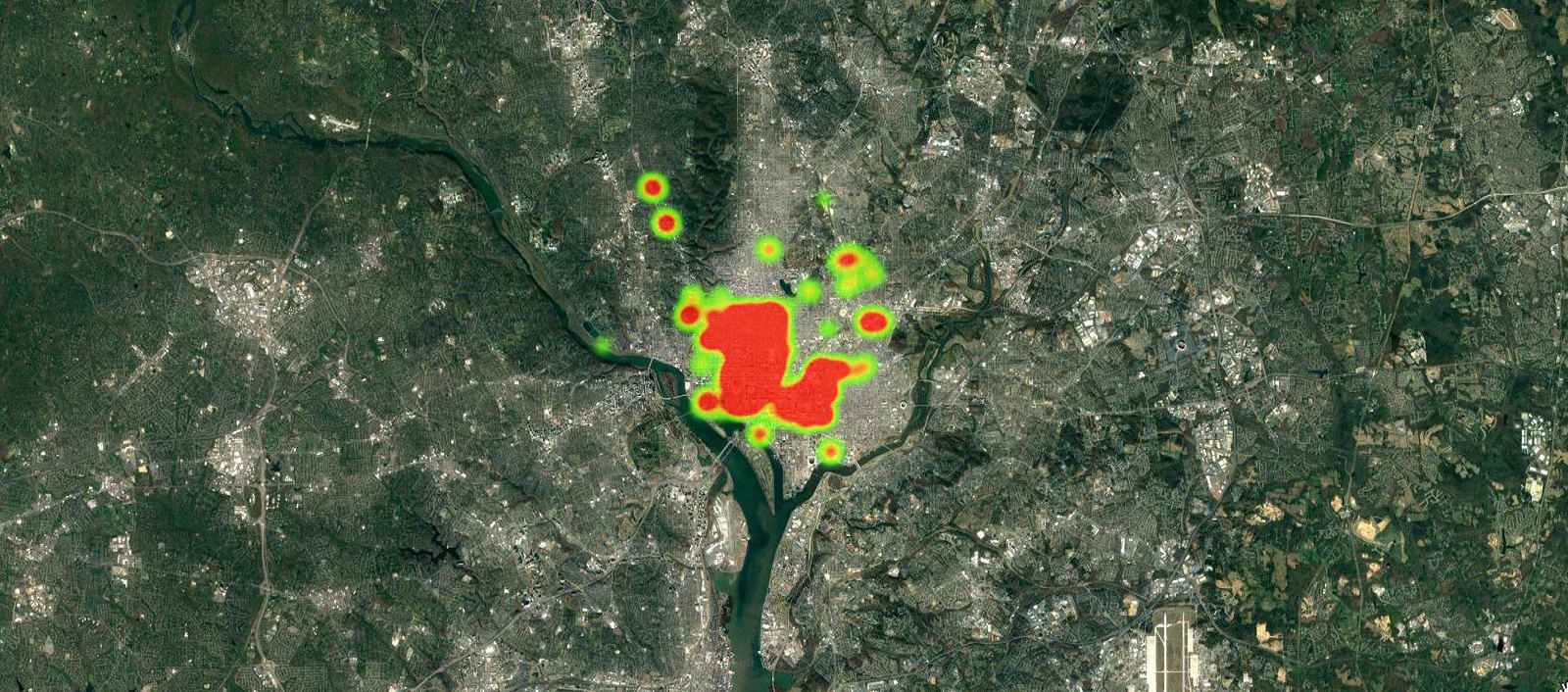
Thanks to Washington, DC’s open data diplomat, Michael Schaede (@MVS202), I received this heat map analysis of photographs I took in 2017. I coned the visualization down to just Washington, DC, because that’s where I enjoy taking photos the most.
In 2018, I can probably venture out of the first 6 wards a little bit more + as is the case in the photos I mostly see taken, they tend to be the more formed parts of a city. Washington, DC, on the other hand, is the best learning lab in the country for societies in formation, so a person can usually find growth and development happening everywhere (see: Thoughts and photos from the gilded ghetto | Race, Class, and Politics in the Cappuccino City, by Derek Hyra)
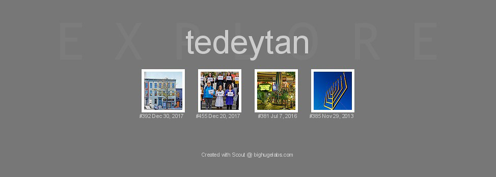
Also, from time to time, Flickr, using an opaque algorithm, boosts photos into its Explore pages, which makes them go viral. That’s what happened to this one. The whole experience is a reminder that there’s appreciation of beauty, and then there’s algorithmic faux-appreciation of beauty 🙂

From this blog post:

For the year of photos (2017) in review: