Note: This is a guest post by Lygeia Ricciardi ( @Lygeia ). I’m an enthusiastic fan of consumer engagement in health and a friend of your host, @TedEytan
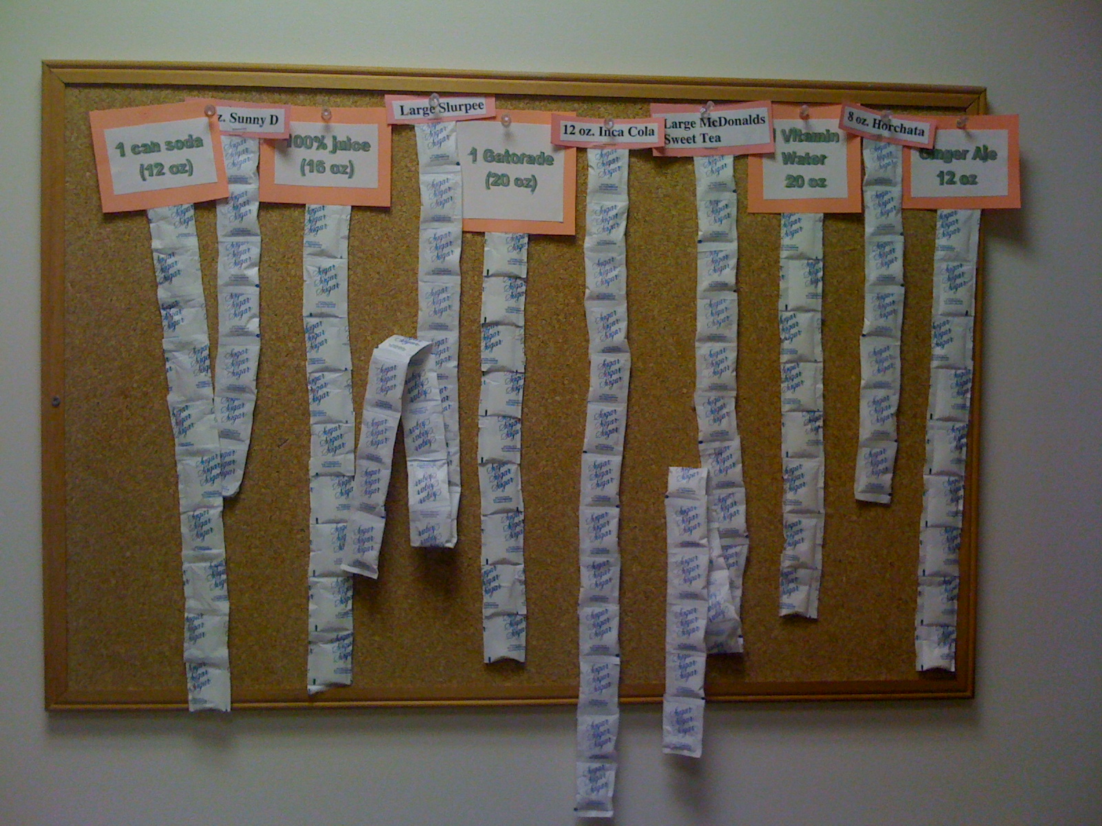
I took this photo at a Washington DC area hospital. The display uses packets of sugar tacked onto a bulletin board to illustrate the equivalent amount of sugar in a variety of popular drinks:
– 1 can soda (12 oz)
– Sunny D (can’t see size)
– 100% juice (15 oz)
– Slurpee (large)
– Gatorade (20 oz)
– Inca Cola (12 oz)
– McDonald’s Sweet Tea (large)
– Vitamin Water (20 oz)
– Horchata (8 oz)
– Ginger Ale (12 oz)
Wow. I knew soda had a lot of sugar, but this really makes the point. And though I would never consider putting 7 or 8 packets of sugar in a cup of coffee, I didn’t think of, say, Vitamin Water as a big splurge when it comes to sugar. (Could it be the clever marketing?)
This display is not, obviously, a formal, peer reviewed statement on health. It’s home grown, informal, and extremely approachable for the intended audience: patients. The nutritionist who assembled it didn’t compare standard volumes of each beverage. Instead, she used the volumes they are typically served in: cups, cans, and bottles. The display gets you thinking not only about relative sugar content, but also about the importance of portion size.
I think it’s a great use of every day objects for public health education. Have you seen anything similar that helped to inspire or inform you?
3 Comments
Great sugar visualization! RT @tedeytan: Photo Friday, this week (another) great guest post by @lygeia http://bit.ly/93FWkZ
Love the visual of sugar! RT @tedeytan: Photo Friday: How Sweet It Is http://bit.ly/93FWkZ
RT @tedeytan: Photo Friday, this week (another) great guest post by @lygeia : How Sweet It Is http://bit.ly/93FWkZ