I (and many others in the social media space) don’t really like stock photography. The problem with it is that it isn’t real, so what does it illustrate except that someone somewhere was in a studio pretending to do something. I wrote about this previously: (See: Health care is usually not a stock photo (of rainbows and butterflies)
Regina Holliday ( @ReginaHolliday ) has even set up a group on Flickr where people can add “Reality Stock Photography” photos (which you are welcome to use because they are copyright free).
When I thought about what image should represent “Green” in health care, I realized it should not be a plant, or the “marble shot” of Earth, or glaciers.
Here’s the photo that comes with the slide template that we use where I work, The Permanente Federation:
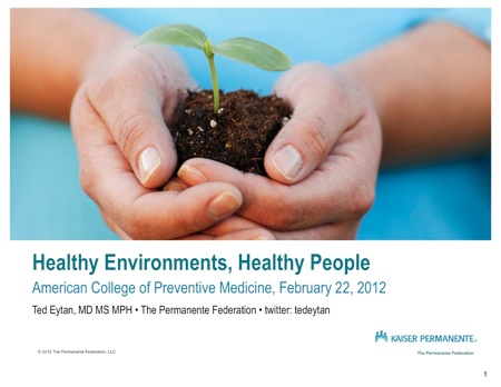

The photo is not great because it doesn’t show anything real (and it’s designed to be a placeholder, the template designers encourage us to swap it out :)), and it’s also the wrong way to introduce the topic of climate change to a medical audience.
This learning came about because I was invited to speak on behalf of Kaiser Permanente on the topic of the “greening” of medical practices at American College of Preventive Medicine ( @ACPM_HQ ) 2012, through our (very talented) Green Team.
This was a stretch for me on some level. On another level when I dug into the content and data (so helpfully supplied to me including from the Green Community on our internal social network), I realized the concepts and philosophy are not that different from what I know much better, patient-centered health information technology.
Back to the photos, I always take time to pick a cover photograph that’s:
- Not a stock photograph, which means something I’ve taken or has been taken of real people/things.
- Has some meaning to the topic
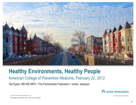
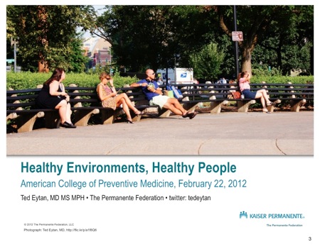
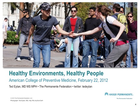
So after some thinking I used a series of images, that I took myself, of parts of the city I live in that illustrate the importance of a healthy environment. And guess what, they are the same images I would use to illustrate : Total Health, Prevention, Health Information Technology, Patient empowerment, etc etc.
Next photos, better choices (click to enlarge):
From top to bottom, they are: View of the US Capitol from the Eckington neighborhood, Washington, People sitting on Dupont Circle, People doing the LIndy Hop on Dupont Circle, People using bike share bicycles on 17th Street, Washington, DC.
All of these photos are Creative Commons licensed, you are free to download them, and you can get them here. I’ve also set up a Pinterest Board on the topic of Climate Change and Health.
In the all day session at American College of Preventive Medicine, that we were exposed to research that shows that it is in fact a mistake to talk about Climate Change as an issue of polar bears rather than as an issue of people. You can access this research here.
And yet…as I got off the plane at National Airport there was a huge poster showing two images, of an Alaska glacier 20 years ago, and today, to illustrate the problem of climate change. I wish I had takean a photo of it, however, thanks to Google you can see it here. This approach does not resonate with Americans.
What does resonate is the fact that my allergies look like they are starting almost a month earlier this year….talk about increasing the cost of health care and our CO2 footprint.
I’ll put the rest of the presentation up in another post. I learned in this process that climate change is a serious health issue for humans, and that health care should do what it can to mitigate the effects. Not doing anything means undermining ourselves.
Do you have any favorite images that you would use to illustrate climate change and health? Post in the comments!